Logos for the 4 finalists to host the 2016 games. I'm liking Chicago and Madrid.
couture sushi
couture sushi? print ads by taku satoh design office for issey miyake's pleats please line.

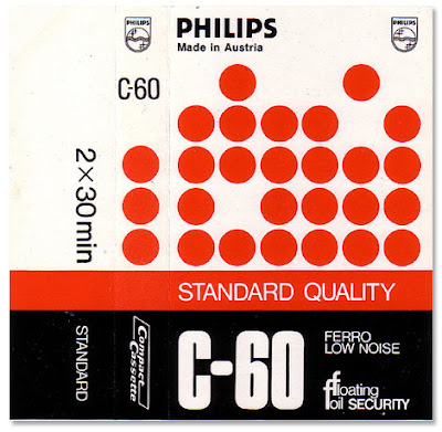
vintage cassettes
I was old enough to catch the tail end of the cassette era. Making mixtapes was truly a crafty endeavor. Especially if you were too cheap to buy a blank cassette and you taped over an existing retail cassette by scotch-taping over those rectangular holes on the top edge. You could tape over the same tape hundreds of times, chalking up the loss of quality to an endearingly dusty and vintage sound. Even if the tape loop got stuck or unraveled out the bottom, you were resourceful enough to grab a pen, stick it in the spokes and wind it back into place.
Then you'd flex your recording engineering skills by deftly manipulating the record/pause buttons on your "box" to seamlessly transition parts of songs and efficiently fit everything within the 45/60/90 minute limit per side. My early forays into graphic design involved making homemade cassette wrappers. I would trace the blank cassette template onto a medium weight paper, design and illustrate the cover, spine, flap and inside and fold it into the holder.
Ahh, the simple pre-digital age. Here's a flickr gallery of some vintage blank cassette inserts from the 70's & 80's.


WhatTheFont
WhatTheFont is a cool iPhone app that can identify fonts that may allude the internal font library in your brain. Ok, maybe that's just me. But I've had an interest in typography since childhood. All you have to do is take a photo of the font in question and the app will recognize individual letters and identify it. Its most effective when the text is clear with high contrast definition.
best band logos
According to spinner.com. I'm not a fan of the korn or phish logo. PE and Wutang should be higher...
shigeo fukuda appreciation
R.I.P. to graphic designer Shigeo Fukuda, who died at age 76. One of his famous award-winning posters is "Victory" (1975).
best & worst logos '08
Yes, we're well into '09, but brand new blog had a great recap of the best and worst logo redesigns of '08.


obama logos that weren't chosen
Below were the three finalists. They made the right choice. The "O" logo is such an icon. The brand design and marketing of Obama was flawless.


1950's SAS airlines menu
Found this off grainedit. Great 50's design in this 1958 dinner menu celebrating the 1st anniversary of Scandinavian Airlines' North Pole Route from Copenhagen to Tokyo.


Panasonic Design Museum
I love looking at modern electronics and design of the past.
Great nostalgia and great site here.

typocalypse now
Each font has its own distinctive personality and holds the power to transform a design all by itself. Design pubs spew historical and/or psycho-analytical breakdowns of a particular fonts and font families. There was even a movie on Helvetica. Designers love to play their favorites - some of my former colleagues have even dressed up as fonts for Halloween. Only a graphic designer would come up with something like that. Here's a funny breakdown on fonts courtesy of typocalypse:
died young, stay pretty
trailer for the movie "died young, stay pretty", documenting the growth of the underground poster scene.
Find It
Profile

- papundy
- new jersey, USA
- art admirer and mind traveler scrapbooking inspirations of all kinds
Tags
- ads (13)
- art (109)
- baltimore (4)
- cars (5)
- chicago (3)
- design (66)
- family (9)
- fashion (11)
- food (41)
- japan (44)
- kicks (1)
- media (3)
- movies (40)
- music (126)
- music video (24)
- new jersey (4)
- nyc (12)
- philippines (26)
- philly (15)
- photography (23)
- politics (5)
- race (15)
- rants (61)
- sneakers (44)
- sports (58)
- stuff (50)
- technology (16)
- toys (11)
- tv (28)
- video (108)


